Creating a twitter bot in Python

I live in a village just outside Tunbridge Wells in Kent. Recently there have been several issues with the train line which have affected my commute to London. If I had known of the issues in advance I would have taken action such as working from home or driving to another station. To see what the bot is tweeting about check out it’s page. The reason I decided to publish to twitter was because they have good reliable infrastructure and it would enable others in the local community to benefit by being kept informed. In my case I simply follow @FrantStation and then click on the bell icon in the twitter app so that I’m informed of all tweets from this account.
Any tweets are pushed to the notification centre of my phone and from there are also pushed to my Smart Watch. I can be sat in a meeting at work and be made aware that trains are running late or cancelled, or if the account is noisy in the morning I may decide to work from home or drive to a different station.

So how much effort is it to create a bot which can push information in near real time ? Perhaps you are an IT company providing an SAAS service and would like to provide an easy way for customers to know if there is an outage of your service ? In the last case the monitoring code will be slightly different, perhaps you would use a library like requests to hit a web page and check that it returns 200, with any other response being tweeted out.

Well it turns out that the first version of this code (one big script) was only around 88 lines of code which included logic to make a SOAP request to national rail, extract the relevant information and send a tweet if the train was over 4 minutes late or cancelled. The rail bot is perhaps a little involved so let’s create something simpler.

Firstly head over to https://developer.twitter.com and click on the apply button. You will need to fill in a few details such as the purpose of the account and what it will be tweeting. Note that you might find the main account is blocked which is likely to be case if you have created a new account. In this case you will need to login to the main account and pass the captcha checks to confirm you are a human.
After apply the next step is to create what twitter call and application. In this part you will be able to generate / regenerate 4 keys.

  • API Key
  • API Secret Key
  • Access Token
  • Access Token Secret

Next for this demo we will want to install a few libraries / modules. In order to avoid creating any problems with existing libraries lets create a new virtual environment. If you are writing python code and not taking advantage of virtual environments, it really is about time you started to use them.

This tutorial assume you are using python 3 which already has the venv module available by default

Open up a terminal and make a new folder

  • mkdir TwitterBot
  • cd TwitterBot
  • python3 -m venv venv

The above will create a new subdirectory called venv with a various sub directories.

Assuming you are using linux / osx now type in

  • source venv/bin/activate

This will change you command prompt and ensure you are inside the virtual environment.

Now we want to install some libraries some type the following commands

  • pip install python-twitter
  • pip install requests

We have installed two modules.

  • python-twitter – this will enable us to send tweets from our code
  • requests – this make handling http requests easy. In the sample code we will check if a local web server is running and if it fails we will send a tweet.

Ok we are almost done. Next we want to run a web server. Installing a server such as apache is beyond the scope of this article. Lets just run a basic server using a single command. Open up a new terminal window and type the command below

  • python -m http.server 1234

The above command will start a web server listening on port 1234

Ok now we have a server up an running lets write some code. Save this file as Bot.py in the TwitterBot directory.


def checkServer():
    import requests
    try:
        response = requests.get('http://localhost:1234')
        if response.status_code != 200:
            return False
        else:
            return True
    except:
        return False

def sendTweet(message):
    import twitter
    import datetime
    now = datetime.datetime.now()
    dtNow = now.strftime("%Y-%m-%d %H:%M:%S")
    twitterApi = twitter.Api(consumer_key="YOUR_CONSUMER_KEY",
                             consumer_secret="YOUR_CONSUMER_SECRET",
                             access_token_key="YOUR_ACCESS_TOKEN",
                             access_token_secret="YOUR ACCESS KEY")
    twitterApi.PostUpdate("{} => {}".format(dtNow, message))

if __name__ == '__main__':
    serverStatus = checkServer()
    if not ServerStatus:
        sendTweet(" we are sorry but our server is down we are working to resolve the issue - please be patient")

The above is very simple and will simply check if a server is running / and if not tweet about the problem. As can be seen sending a tweet is very easy you need just 2 lines on code. One to create the object and set the keys and then a call to the PostUpdate method.

Next we probably want a way to schedule this.

On unix type the following

  • crontab -e

Now we need made a to make a scheduled entry to run our simple bot. Lets say we want to monitor and tweet every 5 minutes

*/5 * * * * source /Users/hugo/Projects/TwitterBot/venv/bin/activate && python /Users/hugo/Projects/TwitterBot/Bot.py >> /Users/hugo/Projects/TwitterBot/log.log 2>&1


The cron job will check if every minutes. In this case we need to stop the sample server before we will say anything sent out. So go back to the window in which you ran the command python3 -m http.server 1234 and press ctrl-c. When the cron job next runs it will start tweeting about the server being down.
Viewing Apache Spark Dataframes in Jupyter Notebooks / iPython

Anyone who has used python and pandas inside a jupyter notebook will appreciate the well formatted display of a pandas dataframe. Unfortunately the .show() method on a spark dataframe is like taking a step back in time and viewing an ascii based layout on a terminal. In a previous post we talked about viewing the data in Apache Zeppelin and have to admit that zeppelin is pretty cool.

However users who predominately use Python and Pandas would generally prefer to stick to a single tool. So how can we improve the viewing experience  of Apache Spark data frames in jupyter notebooks.

The good new is starting with Spark 2.4 a new configuration setting has been added which can be enabled and will produce a nice looking output in just one command. Firstly lets take a look at this new setting, and then see how we can also get nice formatting on old version via monkey patching the dataframe class in pyspark.


from pyspark.sql import SparkSession
from pyspark.sql.functions import udf, array
from pyspark.sql.types import StringType
from datetime import datetime as Date
from pyspark.sql.dataframe import DataFrame
spark = SparkSession.builder.appName('play').getOrCreate()

data = [
[10,'Direct Sales',Date(2019,1,1)],
[12,'Direct Sales',Date(2019,1,2)],
[20,'Online Sales',Date(2019,1,1)],
[25,'Online Sales',Date(2019,1,2)],
]

df = spark.createDataFrame(data , ['Revenue','Department','Date'])

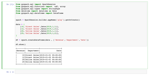
df.show()

pySparkDataFrameShowInJupyterNotebook

Wow the above is a long way from a nicely formatted pandas DataFrame. Ok so lets have a look at the new setting (spark.sql.repl.eagerEval.enabled) in Spark 2.4

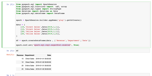
To enable this option simple type the following into your jupyter notebook.


spark.conf.set("spark.sql.repl.eagerEval.enabled", True)

With this setting enabled we don’t even need to use the .show() method we can type type the name of the dataframe.

pySparkDataFrameJupyterNotebookEagerEval

Looking much better. But what if we are using an older version of Spark ? Or what if we want to enhance this to view sparklines ?

Well fear not we can just monkey patch this functionality into the pyspark dataframe. The key to making this work is understanding that under the hood jupyter is using duck typing. When a dataframe is evaluated without any function calls the internal method _html_repr_ will be called.

With this knowledge you can now monkey match the Dataframe to add your own functionality, first lets create a method called toHtml()


def toHtml(self):
    """Returns a dataframe - supports spark lines"""
    import cgi
    from itertools import islice
    if not self._support_repr_html:
        self._support_repr_html = True
    max_num_rows = max(self.sql_ctx._conf.replEagerEvalMaxNumRows(), 0)
    sock_info = self._jdf.getRowsToPython(
    max_num_rows, self.sql_ctx._conf.replEagerEvalTruncate())
    rows = islice(self.toLocalIterator(), 0, max_num_rows)

    html = "</pre>
\n" #generate table header html += " \n" % " ".join(map(lambda x: cgi.escape(x), df.columns)) #generate table rows for row in rows: html += " \n" % "".join(map(lambda x: str(x), row)) html += "
<table border="1">
<tbody>
<tr>
<th>%s</th>
</tr>
<tr>
<td>%s</td>
</tr>
</tbody>
</table>
<pre>
\n"
    html += "only showing upto %d %s\n" % (max_num_rows, "row" if max_num_rows == 1 else "rows")
return html

With the above method created we just need to monkey patch the underlying library

from pyspark.sql.dataframe import DataFrame
DataFrame._repr_html_ = toHtml

The magic is done by the second line of code. The first line simply being an import.

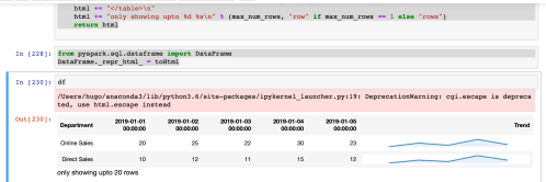
So lets see this in action. In this case we will include a sparkline in the output, similar to our earlier efforts with sparklines on Pandas and with Apache Spark on Zeppelin.

pySparkDataFrameInJupyterWithSparkline

For those readers interested in how to create sparklines in Jupyer notebooks using Apache Spark and pyspark, please have a look at this post.

Sparklines in Apache Spark dataframes

As readers of this blog will know I’m a huge advocate of data visualisation techniques and an admirer of the work of Edward Tufte.

In a previous blog post we looked at how to add sparklines to a pandas DataFrame and view this in a Jupyter notebook.

I really like Pandas and with Dask it is possible to operate on larger volumes of data, however there are occasions where we might have to deal with “Big Data” volumes and for this purpose Apache spark is a better fit. In this post we examine how we could visualise a sparkline via Apache Spark using the pyspark library from python.

Firstly we want a development environment. Whilst jupyter notebooks is excellent for interactive data analysis and data science operations using python and pandas in this post we will take a look at Apache Zeppelin. Zeppelin is a very similar to jupyter notebook but offers support for python, scala and multiple interpreters.

In this exercise we will first create a new data frame


%pyspark
from pyspark.sql import *
from pyspark.sql.functions import udf, array
from datetime import datetime as Date
from pyspark.sql.types import StringType
sqlContext = SQLContext(sc)

data = [
[10,'Direct Sales',Date(2019,1,1)],
[12,'Direct Sales',Date(2019,1,2)],
[11,'Direct Sales',Date(2019,1,3)],
[15,'Direct Sales',Date(2019,1,4)],
[12,'Direct Sales',Date(2019,1,5)],
[20,'Online Sales',Date(2019,1,1)],
[25,'Online Sales',Date(2019,1,2)],
[22,'Online Sales',Date(2019,1,3)],
[30,'Online Sales',Date(2019,1,4)],
[23,'Online Sales',Date(2019,1,5)],
]

df = sqlContext.createDataFrame(data , ['Revenue','Department','Date'])

The code above will create a dataframe with 10 rows and 3 columns. This sample data is simulating 5 dates and the sales in 2 different departments.

In terms of viewing a chart we want to pivot the data, note how the syntax of the pyspark  pivot is 3 function calls and not as easy to read as the equivalent pandas pivot or pivot_table function.


df = df.groupBy("Department").pivot("Date").sum("Revenue")

Having flattened the data into 2 rows we want to add another column called “Trend” which contains the sparkline, however first we need to create the function which will draw the line.

To draw the line we will use matplotlib. Note however the function is virtually identical to the code we used for pandas.


def sparkline(data, figsize=(4, 0.25), **kwargs):
    """
    creates a sparkline
    """
    from matplotlib import pyplot as plt
    import base64
    from io import BytesIO

    data = list(data)

    *_, ax = plt.subplots(1, 1, figsize=figsize, **kwargs)
    ax.plot(data)
    ax.fill_between(range(len(data)), data, len(data)*[min(data)], alpha=0.1)
    ax.set_axis_off()

    img = BytesIO()
    plt.savefig(img)
    plt.close()
    return '%html <img src="image/png;base64, {}" />'.format(base64.b64encode(img.getvalue()).decode())

Note how the function above is effectively the same as the one we used in a previous post apart from the %html part. This string is used by the zeppelin notebook to ensure that our base64 encoded string is displayed in the notebook as HTML.


Next we will create a UDF and add a columns to the dataframe before finally exposing the dataframe as a table so we issue straight sql against it


pivot_udf = udf(lambda arr: sparkline(arr), StringType())

df = df.withColumn("Trend",pivot_udf(array([col for col in df.columns if col != 'Department'])))
df.registerTempTable("df")

In the lines of code above we use withColumn and pass the columns which contain the numerical data to the UDF. (The row contains Department and 5 numeric fields for each date, since the Department is a text value we do not want to pass this, hence the list comprehension used to build the array)

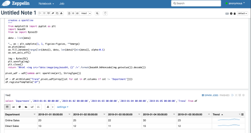
Finally we can view the data using a straight select statement. Note in this case the pivoted column names as dates which contain a space hence the use of backticks around the field names

pySparkZeppelinSparkline

Sparkline produced using pyspark and apache Zeppelin

Loading a pandas DataFrame from a database

Readers of blog will know about my frustrations with the standard python DB-API. In order to overcome this limitation I created a simple class, the key concepts of which are detailed here.

Over the past few months I have started to use pandas extensively at work. This would frequently take the form of loading data frames from different databases and formats (select statements and output of stored procedures).

I used to generally load the dataframes with a simple bit of code which looked like this.


with DBConnection() as db:
  df = pd.DataFrame(db.GetResults("select * from emp"))

The above code takes advantage of the fact that the GetResults function returns an iterable dictionary, with the keys being the column names of each row and the value being the values.

The code was working well and running a complex report in production, however after a week it failed! At a very high level the report was performing a reconciliation by querying metadata from one system, getting fact data from another system and them calling a series of stored procedures.
On the occasion when the code crashed, the code was having issues with a pandas groupby statement. On checking the dataframe concerned was empty, but this wasn’t the cause of the crash. The problem was an empty dataframe was created without any columns being defined. The later code tried to reference column names to perform a group by and the process crashed.
So what’s the best way to load a dataframe from a database ? We still want to keep things simple, like above.

Lets create a new method

  def GetResultsAsDataFrame(self, query, size=5000):
    
    def GetResults(size=size):
      while True:
        results = c.fetchmany(size)
        if not results:   
          break
        for result in results:
          yield result
        
    import pandas as pd
    with self.ClosingCursor() as c:
      c.execute(query)
      fieldNames = [x[0] for x in c.description]
      return pd.DataFrame(data = GetResults(size), columns=fieldNames)

Here we create a method which accepts a query and has a default fetch size. On line 3 we create a nested method which is used internally. The nested method is because we want to use an iterator for scalability purposes. On line 14 we create a list which contains the column names in the database result set and on line 15 we create a pandas datatable using the list of column names and the inner function from line 3.

So how does this differ to the previous code, where an iterable dictionary was used to create the dataframe ? Well it’s a lot better, in the event that no rows are returned from the database an empty dataframe will be created which has defined column names. Think of this as being analogous to an empty table in a database.

So lets take a look at how this function can make us more resilient in the real world. In the made up example below we have 2 tables, emp and dept. The emp table has 3 rows, whilst the dept table is empty. In this case we are going to group the data and join it in pandas. As mentioned this is a contrived example, in the real world the tables might exist in different databases, or the data required for the merge might come from the output of a stored procedure call.

with DBConnection() as db:
    db.execute("create table emp (name text, dept int, salary int)")
    db.execute("create table dept (dept int, name text)")
    db.execute("insert into emp (name, dept, salary) values ('Hugo', 1, 1000)")
    db.execute("insert into emp (name, dept, salary) values ('Karen', 2, 800)")
    db.execute("insert into emp (name, dept, salary) values ('Holly', 2, 600)")
    emps = pd.DataFrame(db.GetResults("select * from emp"))
    EmployeesByDept = emps.groupby('dept').sum()
    depts = pd.DataFrame(db.GetResults("select * from dept"))
    EmpAndDept = emps.merge(depts , how="left", left_on="dept", right_on="dept")

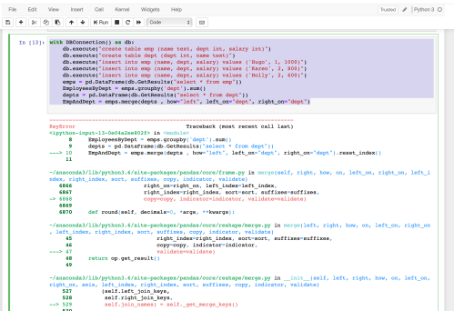
The above code will crash, at the merge operation with a KeyError, because the second data was an empty dataframe, which did not have any columns defined. Why were their no columns defined ? Because GetResults returns an iterator and in this case there were no rows to iterate over so no dictionary was returned.

PandasEmptyDataframeMergeCrash.png

Give we created a new function earlier lets change the code to use the new method and see the difference

with DBConnection() as db:
    db.execute("create table emp (name text, dept int, salary int)")
    db.execute("create table dept (dept int, name text)")
    db.execute("insert into emp (name, dept, salary) values ('Hugo', 1, 1000)")
    db.execute("insert into emp (name, dept, salary) values ('Karen', 2, 800)")
    db.execute("insert into emp (name, dept, salary) values ('Holly', 2, 600)")
    emps = db.GetResultsAsDataFrame("select * from emp")
    EmployeesByDept = emps.groupby('dept').sum()
    depts = db.GetResultsAsDataFrame("select * from dept")
    EmpAndDept = emps.merge(depts , how="left", left_on="dept", right_on="dept")

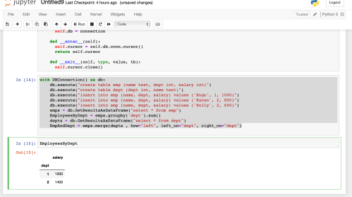
In this case we are missing data from one side, but we do not watch to crash.
As can be seen in the image below the code is now a lot more graceful and allows empty dataframes to be used in futher operations like merge, grouping etc..

PandasDataFrameMergeOneEmptyFrame

Sparklines in Jupyter notebooks / ipython and Pandas

For those who are unaware sparklines are very small charts which are typically rendering inline with data. These are effectively condensed charts which give visual clues to the reader. They grew in prominense after being advocated by Edward Tufte one of the grandfathers of data visualisation.

In a previous post we examined how to create sparklines in Excel when a library does not natively support them. For the curious this used a trick with a formula and a special font, details of which are documented here.

Whilst this is a good approach for creating static reports a great deal of interactive data analysis will be done using python and pandas.

Many data scientists will choose to use Jupyter notebooks or ipython as a smart interactive shell, so lets look at how we can add sparklines to Jupyter / pandas.

Lets get started. We will need a few imports and a few tweaks to the display


import pandas as pd

# Turn off the max column width so the images won't be truncated
pd.set_option('display.max_colwidth', -1)

# Turning off the max column will display all the data
# if gathering into sets / array we might want to restrict to a few items
pd.set_option('display.max_seq_items', 3)

#Monkey patch the dataframe so the sparklines are displayed
pd.DataFrame._repr_html_ = lambda self: self.to_html(escape=False)

Line 1 – imports pandas and aliases the library using the standard naming convention of pd

Line 4 – removes settings on the column width. This means the sparkline will display in full without being truncated.

Line 8 – this isn’t really needed but if you collect data into objects such as arrays or sets this will restrict the amount of information displayed.

Line 11 – This is perhaps the most important line. This monkey patches all dataframes so that the pivot line will get displayed correctly without needing to pass any additional arguments or calling any extra functions

Next lets take a look at the function which creates the sparklines this is based on a gist by Chris Seymour, but modified for python 3+

def sparkline(data, figsize=(4, 0.25), **kwargs):
  """
  creates a sparkline
  """
  from matplotlib import pyplot as plt
  import base64
  from io import BytesIO

  data = list(data)

  *_, ax = plt.subplots(1, 1, figsize=figsize, **kwargs)
  ax.plot(data)
  ax.fill_between(range(len(data)), data, len(data)*[min(data)], alpha=0.1)
  ax.set_axis_off()

  img = BytesIO()
  plt.savefig(img)
  plt.close()
  return '<img src="image/png;base64, {}" />'.format(base64.b64encode(img.getvalue()).decode())

lines 5-7 are just imports

line 9 – copies the passed in data into a list
line 11 – creates a space where the data will be charted
line 12 – plots the line chart
line 13 – fills in the area under the line to give visual perspective
line 14 – removes the x and y axis since we want a sparkline

line 16 – creates a bytesIO object to save the image into
line 17 – saves the chart in memory into the bytesIO object
line 19 – returns the chart as a base64 encode HTML image tag. Since this is base64 encoded everything is self contained and there is no need to save the image to disk or serve it via a web server.

Ok we are done. We have enough to display a sparkline in pandas. Lets have a look at an example of this can be used.

data = [
    [10,'Direct Sales','01-01-2019'],
    [12,'Direct Sales','02-01-2019'],
    [11,'Direct Sales','03-01-2019'],
    [15,'Direct Sales','04-01-2019'],
    [12,'Direct Sales','05-01-2019'],
    [20,'Online Sales','01-01-2019'],
    [25,'Online Sales','02-01-2019'],
    [22,'Online Sales','03-01-2019'],
    [30,'Online Sales','04-01-2019'],
    [23,'Online Sales','05-01-2019'],
]
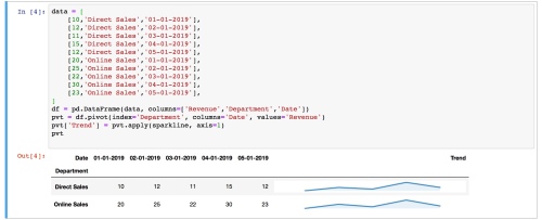
df = pd.DataFrame(data, columns=['Revenue','Department','Date'])
pvt = df.pivot(index='Department', columns='Date', values='Revenue')
pvt['Trend'] = pvt.apply(sparkline, axis=1)
pvt

lines 1 – 12 define a variable with some dummy data. In reality this would be read from a CSV, database, web service etc..
line 13 – creates the dataframe
line 14 – pivots the dataframe
line 15 – adds a new columns called ‘Trends’, which will be the sparkline.

Lets take a further look at line 15, since this is the call that is doing all the work of creating our sparklines. Here was call the apply method with an argument of our pivot function and pass in the row (axis 1). As already described the return value of the call is a HTML image tag with the contents being a base64 encoded in memory chart.

So we are done. Line 16 is just the variable name and as most readers will already name if we just type in the variable of the dataframe the default behaviour is to display the contents.

The final result is show below. As can be seen this whole exercise involved only a minimal amount of develop. With just a few lines of code we have enabled a visualisation which gives a us a very quick insight into the data and provides visual clues to assist us in gaining a quick understanding of new datasets

pandassparkline

Fool proof sparklines (how to create them even if your library does not support them)

Many people in the data domain will be well aware of the usefulness of visualisation, and presenting data in a meaningful easily digestible format. Early in a data practitioners career most data might be show as a table; as the person develops they  soon begin to understand the importance of charting and plotting.

Faced with a new dataset one of the first tasks undertaken is often to plot the data to get a better understanding. Is the data random; is it clustered ? If clustered, are there several discrete groups ? If there are groups, are there outliers which might represent noise or bad data; all of these can be quickly observed by plotting a chart, but would not be visible in a table of thousands or millions of rows.

Many great strides have been made in the visual representation of data and one the grandfathers of this approach was Edward Tufte who has authored numerous books on the visual representation of data.

Tufte is a great advocate of sparklines. For those who are unaware of sparklines, think of them as a graph compressed to the size of a piece of text. Lets imagine a situation where this might be useful. On a hospital ward a patient might have readings taken at regular intervals and recorded on a piece of paper. Any visiting doctor / registrar will need to look through the paperwork and build a mental image in their head.

patientsparkline

Shown above is an enlarged spreadsheet showing regular readings of a pulse over time. Notice how you can quickly spot a peak in the pulse with the inline condensed chart. Using this you might follow the data trail back to find out the time this occurred and then see if the patient was adminstered any medication or if any factors occurred which might have resulted in this peak.

Having established how pioneers of data visualisation such as Tufte are keen advocates on the use of such compressed charts, lets now turn our focus onto issues developers might face in creating them.

In normal circumstances a user can create a chart in excel via pointing and clicking, however a developer often has to use a library and write code to create a spreadsheet. Many of the underlying libraries expose different features to the developer and some lack the ability to create things such as sparklines.

In the python domain libraries such as xlsxwriter are fairly feature rich in terms of spreadsheet creation however they lack the ability to read excel files. In some circumstances such as when using a spreadsheet as a template, we need the ability to both read a spreadsheet and create a new file based on reading the template in the first sheet. An example of this is the authors jinja2 extension which enables markup to be placed in a sheet and data added based on this.

Libraries such as openpyxl which can both read and write data currently lack the ability to create native sparklines. How can we overcome this limitation ?

Well fear not help is at hand with the clever use an excel formula.

Excel contains a formula called rept which repeats a given value, go ahead try it out

=rept(‘a’ , 10)

The formula above will output “a” 10 times.

This does not appear very useful; how on earth could this help us in creating tiny embedded charts in a backwards compatible way or with a library in a language such as c# / python which does not natively support the creation of sparklines ?

Lets move this forward slightly and apply this to some data, this time using a pipe as the initial field

sparklinenofont

Well that looks a mess it’s just a load of pipes

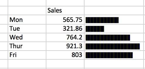
The next step is to change the font to one built into windows and macs called “Playbill” which will make the rept output appear as a continuous bar chart

sparklineplaybillfont

A sparkline using the playbill font

The problem with the above is the charts are too large, we need a way to standardise them in relation to one another.

In this case we can use a formula such as

=REPT(“|”,C3*100/MAX($C$3:$C$7))

Where C3 is the cell which contains the measure we want to chart and C3:C7 is the range we want to normalise against.

horizontalbarsparklinewithreptnormalised

Ok this is all very well and good but what if we want to show the data as a more traditional bar chart, and also include multiple bars within the same excel cell.

Lets have a look at this use case in more detail, starting with the basics. First of all we want to flip the column orientation from horizontal to vertical.

verticalbarchartsparkline

Step 1 – use the rept formula and the playbill font

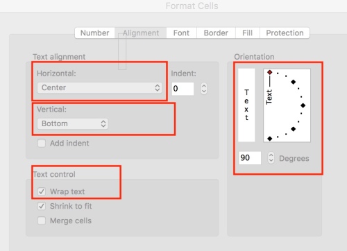
Next right click on the cell and select Edit properties.

EditPropertiesOfCell.jpeg

Change the following

  • Horizontal alignment to center
  • Vertical alignment to bottom
  • Wrap Text
  • Orientation 90 degrees
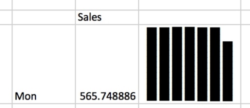
VeritcalSingleChartSparkLine.jpeg

Hmm that doesn’t look like what we really wanted

Whilst the above is showing the bar chart vertically, it is not showing the data in relation to any other cells and so has not been normalised in relation to the other values.

Lets keep at this and see how it would appear with 2 values

Firstly we stick with the playbill font, we stick with changing the cell properties and the text alignment but we need to make a few tweaks to our formula.

BarCharSparkLineNormalisedHeightAdjusted.jpeg

In this case we have made a few changes, lets look at them in isolation.

To create a single bar we would use the forumla

=rept(“|”,c3/max(c2:d2)*10)

What is the doing ? c3/max(c2:d2) is working out a ratio. The final * 10 part adjusts this to the height of the cell. If we had a larger vertical cell then we might multiple by 15 or 20 etc.. depending on how tall we want the final rendered bar to be.

The next part of the formula is & char(13). What does this mean? Well this inserts a line break (remember the text wrap we picked earlier, well this means that the new line will continue in the same cell. It must be noted that char(13) is the character used on a mac / OSX on windows you would use char(10). We will show a way to make this operating system agnostic later in this post.

Ok lets build this up a little more with a weeks worth of data. The thing to note is that we just keep repeating the same block in the formula.

5daybarchartsparkline

And there we have it, by repeating the formula and changing just a single cell we have created a bar chart sparkline. Since this a formula it will work with any underlying library to create sparklines.

Just one more thing to note. We mentioned above how char(13) would be used on a mac / OSX and char(10) would be used on windows.

How can we make sure that it works regardless of which operating system the user opens the sheet in ?

We need a way to determine the operating system; we can do that with this formula

=IF(INFO(“system”)=”mac”,CHAR(13),CHAR(10))

So an agnostic approach would be take advantage of this and replace any instances of char(13) or char(10) with this formula

=REPT(“|”,C3/MAX(C3:G3)*10) &  IF(INFO(“system”)=”mac”,CHAR(13),CHAR(10))   & REPT(“|”,D3/MAX(C3:G3)*10)

It should be noted that the data is shown here horizontally. In a traditional database the data might be stored in rows and so need to be pivoted. This operation can be accomplished using case statements in SQL, which can quickly get cumbersome. To learn how to make this operation simple using Pandas take a look at this article.

A good developer will generally find a way to accomplish what they want and will think about the best way to represent that data and provide context and meaning to the end user. Don’t be afraid of using new technologies; issuing a basic select against a database and then pivoting in Pandas is only a few function calls. Creating these sparklines is again simple and rendering the results whilst writing minimal code can also be trivial if you use a template and let the underlying library perform the hard work.

Easy Excel reporting with Python and jinja2

Love it or loath it Excel is a ubiquitous tool which has captured the hearts of many business users. The vast array of functions enable power users to perform complex workflows with relative ease. Whilst many IT professionals might prefer to render a report as a HTML page users generally desire an ability to export this data to excel where they can perform further analysis.

Python has numerous way of interacting with excel, ranging from low level libraries through to functions built into tools like pandas which make the export simple.

The standard pandas export renders a very basic excel page with minimal formatting. The lower level libraries whilst powerful can require a significant amount of code to create a report.

In the java domain a high level library called JXLS has existed for many years. Using such a library it is possible to use simple markup in excel templates to create very complex reports with minimal code. Indeed you can read about a tool the author created to extend an ETL tool 10 years ago to make this even easier here.

To assist in making reporting easier from python I have set about creating an extension to Jinja2. Currently the code works and can create reports based on markup. I need to refactor the codebase and will look to commit an initial version to GitHub within the next month.

As a teaser here is the initial functionality, shown below is a basic template

template

A basic template with markup related to a data which will be supplied later

A sample python script to use the template is show below


def main():

testData = (
{'name':'Hugo', 'age':41},
{'name': 'Karen', 'age': 41},
{'name': 'Holly', 'age': 8},
)

e = Environment(loader=ExcelLoader('/Users/hugo/testReading.xlsx'), extensions=['ExcelExtension.ExcelExtension'])
sheet1 = e.get_template(e.list_templates()[0])
sheet1.render(items=testData)

The main relevant part is to set a custom loader class as a argument of the jinja2 environment object.

After this the rest of the code should be familiar, a template is rendered, however in this case the output will a spreadsheet rather than a text file.

In this case the excel file will look like the one below.

jinja2exceltemplate

Rendered excel spreadsheet based on jinja2 markup

The above should demonstrate to readers how spreadsheets can be created from any source, such as a list, a CSV file or a database. The template simply accesses the fields / properties of an iterator and creates the output.

Whilst this is useful, where the real benefit of such a templating system becomes apparent is when formulas are created which reference the markup.

jinja2exceltemplatewithformula

Excel spreadsheet with formulas referencing the template

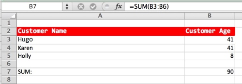
In the case of the above the original formula in the template was sum(b3) this will be dynamically altered according to the data rendered into the template in case of the sample above the formula will become =sum(b3:b6)

jinja2exceldynamicformula

Dynamic formula based on the rendered range

As mentioned the initial code need refactoring and cleaning up and some additional functionality will be included such as:

Ability to created

  • Grouped / outlined reports
  • Pivot tables

Easily Creating Multi sheet Excel Files with python

Creating a multi sheet excel file with the results from database queries used to a time consuming affair.
Firstly you needed to find a library which provided this functionality, then you had to study the API and the write a series of nested loops to create different sheets in the exported file.
Using Java you would typically use a library like Apache POI or perhaps abstract at a higher level and use JXLS, either way you need to write a fair amount of code.

Times change and using modern libraries it really is surprising how quickly and in how few lines of code you can create such an export.

Using python and pandas each DataFrame can be export to an excel sheet with a single line of code. If we had 2 DataFrames called df1 and df2 then creating an excel workbook with 2 worksheets would be as trivial as


import pandas as pd

with pd.ExcelWriter('/Users/hugo/output.xlsx', engine='xlsxwriter') as writer:
    df1.to_excel(writer, sheet_name='People', index=False)
    df2.to_excel(writer, sheet_name='Employees', index=False)
    writer.save()

Creating the pandas dataframes from a sql query is also a trivial matter. It should however be noted that each database provider offers different access mechanisms. The lowest common denominator and the one specified in the standard python DB-API is for the result of cursor.execute() to return a tuple. This will not be sufficient to build a DataFrame with named columns suitable for export to excel.
It should also be noted that a typical database query might also use fetchall() which might not scale, depending on how the client library uses the results. For this reason I would recommend using a simple function such as the following.


from collections import OrderedDict

def GetResults(connection, sql, size=5000):
  c = connection.cursor()
  c.execute(query)
  fieldNames = [x[0] for x in c.description]
  while True:
    results = c.fetchmany(size)
    if not results:
      break
    for result in results:
      yield OrderedDict(zip(fieldNames, result))  
  c.close()

The above method imports OrderDict from the python collections library. The reason for this is by default a dictionary can return the fields in any order. If we are dealing with a SQL query we might reasonable expect the fields in the report to be in the same order and the fields in the select statement. The OrderDict will ensure this is the case.

A very minimal sample issuing 2 select statements against an underling database which then populates separate pandas dataframes and exports them to excel is detailed below.

import sqlite3

connection = sqlite3.connect('/Users/hugo/test.db')

sql1 = "Select name, age from People"
df1 =  pd.DataFrame(GetResults(connection, sql1))

sql2 = "Select empId, name from Employees"
df2 =  pd.DataFrame(db.GetResults(connection, sql2))

#export it
with pd.ExcelWriter('/Users/hugo/output.xlsx', engine='xlsxwriter') as writer:
  df1.to_excel(writer, sheet_name='People', index=False)
  df2.to_excel(writer, sheet_name='Employees', index=False)
  writer.save()

Slow python insert performance into Microsoft SQL Server

I have been getting familiar with a pure python database provider called pytds, to install this simply type.

pip install pytds

Whilst there are other providers available such as ODBC based ones this provider is written in pure python so you can get more assurance it will work without having to resort to installing lots of dependencies or resorting to docker containers and the like. In addition this implementation supports what Microsoft call Table Value Parameters. Given how prevalent features such as Table Value Types / Parameters have become it makes sense to use a provider which supports them.

When using a new database provider I always like to perform a few performance tests, checking on insert and select performance.

DB-API2 details a method called executemany() which normally offers good performance (so far I have used this method on DB2, Sybase, Postgresql and sqlite). On the above databases I only encountered poor performance against postgresql when using the psycopg2 provider (although it must be noted that there are work arounds such as execute_values)

When testing the performance of this provider I used my standard helper class and the insertBatch method, which under the hood calls executeMany().

I noticed that the python insert methods against SQL Server using pytds were slow so started a profile on the database. The profiler showed that the statements were being sent one at a time, effectively the same as a for loop with an execute.

Given that most versions of SQL Server in production use are now 2008 or above a very simple optimisation would be to use a “multi value insert” which is supported by at least SQL Server, DB2 and Postgresql to my knowledge.

A traditional insert might look like

insert into users (name) values ('Hugo');
insert into users (name) values ('Karen');
insert into users (name) values ('Holly');

A multi value value insert would instead look like

insert into users (name) values ('Hugo'),('Karen'),('Holly');

The main advantage of the above is that rather than 3 network round trips being undertaken all the values are sent in a single network round trip. Multiple columns can also be sent using the values expression.

Infact the above approach is the optimisation which was undertaken by the psychopg2 team to address the issue of the executemany performance with the execute_values method (the hint is in the name)

So we could certainly also address the insert performance issue with pytds using the above approach, but is it needed ? Can we instead take advantage of Table Valued Parameters / types ?

Firstly we need to create a type and a table

 CREATE TYPE UserTableType AS TABLE ( name varchar(255) ) ;

 CREATE TABLE USERS ( name varchar(255) );

The code below shows a basic test to insert around 250,000 rows into a table. Using a built in dictionary file that exists on most unix systems.

conn = pytds.connect(dns="MacMini.local", database="testdb", user="testlogin", password="Passw0rd")
words = open('/usr/share/dict/words', 'r')
inserts = ((row,) for row in words)
tvp = pytds.TableValuedParam(type_name='dbo.UserTableType', rows=inserts)
cur = conn.cursor()
cur.execute('INSERT INTO USERS (name) SELECT * FROM %s', (tvp,))
conn.commit()

The above logic inserted the rows on my slow network in just over 1 second. A huge speedup compared with the slow execute batch method.

So can can we leverage this with the existing Helper class ?

Well there isn’t really any need for any change, the insertBatch method already accepts a generator, client code to leverage this would just contain on extra field (the code to populate the Table Valued Type.

with DBConn(SqlServer) as db:
  with open('/usr/share/dict/words', 'r') as wrds:
    res = ((row,) for row in words)
    tvp = pytds.TableValuedParam(type_name='dbo.UserTableType', rows=res)
    stmt = "INSERT INTO USERS (name) SELECT * FROM %s', (tvp,)"
    db.insertBatch(stmt, res)

Whilst the Table Value Parameter worked well and gave a dramatic increase in performance it should be noted that there are alternative approaches.

  • Multiple value insert as mentioned at the start of this article.
  • Inserting multiple values in a single transaction
  • Using the copy_to method which pytds provides on the Cursor class (the documents suggest this is a bulk method so performance should be similar to a tool like BCP. Although it should be noted that BCP typically locks the table and allows only a single process to insert at any one time, so better performance can be gained using multiple threads

At some point in the future I look at creating a method to assist in performing an execute_values equivalent since although the Table Value Parameters is a very useful technique it requires creating types on the SQL Server I also intend to follow up on the use of copy_to, the method signature is fairly simple.

Performance Issues with Python, Postgresql and psycopg2

In a previous post, I wrote about some of the things I found annoying with the standard python DB-API and wrote a wrapper class to assist and provide a general abstraction layer which could be used against any database.

So far I have used the insertBatch method with a target of sqlite, DB2 and Sybase and have never had any issues with the performance. Recently I was  testing the code against Postgresql with psycopg2 as the driver and the insert performance was abysmal. Reading through the documents of psycopg2 the authors admit that the executemany method in their driver does not perform well. Infact the following is statement in the the online documents

Warning In its current implementation this method is not faster than executing execute() in a loop

Oh dear this isn’t good news. What can be done to keep the API appearing the same but take care of the poor performance with psychopg2 ? Well the document mentions a different method called execute_values() lets make a few changes to the code to help.

Firstly in the previous version we were just using sqlite and left different imports / databases as an exercise to the reader, suggesting that an Enum or similar could be passed in and the class could then import the necessary modules.

Again to keep things simple and to avoid the helper class from having to know too much implementation detail or rely on trying to import modules which may not be installed we will use a generic approach. Firstly we will change the constructor. In the previous version it looked like this the below


import sqlite3

class DBConn(object):

  def__init__(self, connectionFunc):
    self.conn = sqlite3.connect(':memory:')

Lets alter this to accept a function passed in by users of our helper class.

class DBConn(object):
  def __init__(self, connectionFunc):
    self.conn = connectionFunc()

Firstly note we have removed the line “import sqlite”. We have changed the __init__ method to accept a second parameter which will be a function and we assign the return value of this to our internal connection object.

A sample usage of our helper class with sqlite would be.

def mySqlLiteConnection():
  import sqlite3
  return sqlite3.connect(‘:memory:’)

with DBConn(mySqlLiteConnection) as db:
  #Do something with the connection

In the case above we are making the user responsible for any imports. The function they pass should return the connection object. A sample with postgresql would be


def postgres():
  import psycopg2
  d = {
    "host" : "MacMini.local" ,
    "database" : "testdb" ,
    "user" : "hugo" ,
    "password" : "pass"
  }
  return psycopg2.connect(**d)

with DBConn(postgres) as db:
  #Do something with the connection

Now we have seen a way of delegating the responsibility of importing drivers to the user we have a generic class which will take case of resource management (e.g. closing cursors and connections), will enable user to access result set field by name and perform inserts by passing in a generator, regardless of the underlying differences in drivers or implementation details.

Lets make a small tweak to our class to check if the driver is psycopg2. In this case we are not responsible for the drivers, the user could be using anything. To make this work we check the sys.modules dictionary.

import sys
from itertools import islice

class DBConn(object):
  def __init__(self, connectionFunc):
    self.conn = connectionFunc()
    #check to see if driver is psycopg2
    if 'psycopg2' in sys.modules:
      import psycopg2.extras as psycopg2Extras
      self.sycopg2Extras = psycopg2Extras
      ext = sys.modules['psycopg2.extensions']
      self.isPsycopg2 = isinstance(self.conn, ext.connection)

The constructor now has some special checks for pyscopg2. Lets amend the insertBatch method to address the performance issue


def insertBatch(self, sql, it, size=5000):
  for batch in DBConn.chunk(it, size):
    with self.ClosingCursor() as c:
      if self.isPsycopg2:
        self.sycopg2Extras.execute_values(c, sql, batch)
      else:
        c.executemany(sql, batch)

The insert match will now use execute_values if the driver is psycopg2 otherwise it will use the standard executemany method.
The only other thing to note is that when using execute_values the insert statement will look slightly different.
When using executemany a sql statement might look like
“insert into users (name, phonenumber) values (%s,%s)”

With execute_values this should be

insert into users (name, phonenumber) values %s

We can abstract that away later so the user doesn’t know about such things.